Module 4
Why Data Display Matters
Data that's easy to understand builds momentum, accountability, and celebration. It helps frontline staff and leadership see the value of improvement efforts and sustains engagement over time. The way you display data matters as much as the data itself.
The Primary Tool: Run Charts
In QI, showing data over time is more important than showing a single snapshot. A single number tells you where you are today, but it can't tell you whether you're improving, holding steady, or slipping, and it can't show you whether a change you made actually made a difference.
A run chart is simply a line graph that plots your measure over time. Time (days, weeks, or months) goes along the bottom (x-axis), and your measure, like the percentage of completed screenings, goes up the side (y-axis). Each point represents one data collection period, connected in the order they occurred.
Run charts are the preferred display method in QI because they let you see patterns and shifts as they happen and, when you mark the date of a change on the chart, connect a specific intervention to a specific change in the data. This is what separates a run chart from a plain bar graph or a static report: it tells the story of change, not just a single result.
💡 Example: Run Chart in Practice — ED Trauma Screening
A PMHCA coach suggests that a partner site try something simple: post the weekly run chart they've helped compile of completed trauma screenings somewhere staff naturally gather, like next to the breakroom coffee machine. The site agrees to test it, pairing it with a 5-minute huddle each week where staff reflects on progress:
- What helped or hurt screening rates this week?
- What should we try differently?
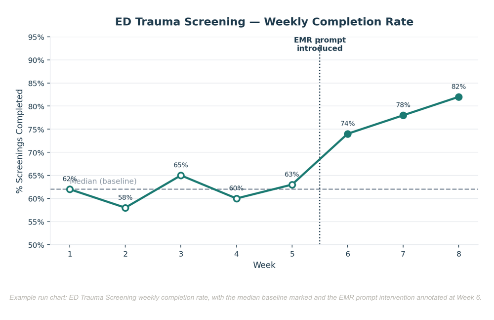
As shown in the chart above, weekly screening rates hovered around a baseline median of 62% for the first five weeks. When the site introduced a new EMR prompt in Week 6, the run chart showed a clear upward shift to 74%, then 78%, then 82% — immediately visible to the whole team, without anyone needing to pull a report.
Result: A small PMHCA suggestion turned a static metric into a visible, shared team story of improvement.
Other Tools You Can Use
Once your team is comfortable with run charts, these can supplement (not replace) them:
- Bar graphs and pie charts: Useful for comparing groups or showing a snapshot at a single point in time, but they can mask trends over time. Use these to supplement run charts, not replace them.
- Dashboards: Combine multiple measures (e.g., screening rate + referral follow-up + family satisfaction) in one visual. Particularly useful for leadership reporting.
- Visual trackers and huddle boards: Sticky note walls, whiteboards, or printed run charts posted in staff areas promote engagement and daily awareness.